A while ago, I was asked to participate with a snippet on what I think is an important lesson on preparing and delivering presentations. I did, and now it appeared in an electronic book together with contributions from 79 other co-authors.
Here is my contribution:
Facts are boring. Stories make them interesting.It’s one thing to expose the facts about climate changing, and another one to tell a story about it. One leaves the audience indifferent, and one gets it excited. Al Gore tried the first one for decades. He had all the right data, but it took him to dress it in a story to get noticed. Yet, what truly brought it to life was him climbing on a stage crane to show what an off-the-charts-value truly means. That’s the power of a demo.
We crave concreteness. We want to sense. Our imagination thrives on examples. Tap that opportunity. Get the audience to experience your story. Don’t just talk about it. Demo it.
A good demo materializes your story and puts energies in motion. But, demoing is more than just marketing. It’s a design tool, too: When you demo, you cannot get away with big words. You have to show your story’s worth. It’s the best feedback mechanism you have available.
Demoing is a skill, and like any skill, it can be trained. Regardless of the subject, there always is an exciting demo lurking underneath. It just takes you to find it. And to do it.
And the full book is available on slideshare.
This semester I have the pleasure of teaching a course on Formale Grundlagen der Informatik at the University of Zürich. The course is targeted at first year students in Computer Science.
As an introduction, I talked about Computational Thinking. The topic for the lecture was inspired by two lectures with the same name by Oscar Nierstrasz (slides download), and by Jeannette Wing (article download).
I set myself to incite the students to look around and see the information and computation behind the functioning of the world. The challenge was to find relevant examples. I struggled for a long time to find them, but somehow I was not satisfied. It was not that I could not find any such examples, but they were not uniform.
I struggled until the day of the lecture, when it finally hit me: If information and computation are so pervasive, it should be straightforward to spot and explain them. I should be able to pick examples at any moment. As a consequence, I challenged myself to put together these examples by documenting the trip from my home (in Bern) to the lecture room (in Zürich). I used my iPhone to take pictures and videos.
I started by telling the students that given that this is the first time I am an official Dozent at the University of Zürich, I wish to mark this day by describing my trip using the pictures I took. I guess they did not understand why this was any relevant for the lecture, but they did laugh. Afterwards, I took exactly the same examples only the second time I described what else can be seen behind the scene. This helped me make the point of the pervasiveness of computational thinking concepts.
I listed below some of the examples I used. The original slides can be found here.
The bus schedule is an example of a data structure made for fast vision-based searching.
The train table is a common resource designed to be read by multiple people in the same time.
People line up in a single queue to buy train tickets from multiple offices.
At the take away shop there are multiple queues for multiple non-conflicting resources.
The vending machine from the train station is a clear example of a state machine.
The instructions of the vending machine form a program that can either be simply read as data, or it can be executed as a program.
During the train trip, the controller checked my ticket. This is also an example of optimistic resource access: you are allowed to use it without any initial check, but get kicked out afterwards if you do not have a valid ticket.
The stack was the most difficult to find. Initially, I looked for it at the free newspaper stand, but as it was afternoon, all newspapers were gone already. I finally found it in the fridge display of a confiserie. I emphasized that one should think twice before buying the last cake from one column, like the chocolate cake on the left which happens to be my favorite.
Finally, the intersection near the University provides a nice example of safety and liveness.
"The basket is tyranny!" said the project leader from IDEO in charge with the team that was featured in an ABC show two decades ago. If you did not see the show it’s well worth 20 minutes. You can watch it online (part 1, part 2, part 3) or you can download it.
The show was entitled "The deep dive" and it tried to give an idea of what innovation is made of inside the IDEO company. The show centers around a simple task with a small challenge on top: IDEO should reinvent the shopping cart. And it should do it in five days. Rather radical, but sure enough, after five days a prototype was proposed that well deserved the "reinvented" label.
There were several new ideas in the proposed prototype, but the most surprising one (at least at the time) was that the shopping cart had no built-in basket. Instead, it had a frame on which multiple removable baskets would fit. This solution presented a double advantage: first, it allowed buyers to place the basket in one place and to shop only with a smaller carry-on basket, and second, a basket-less shopping cart had no value, and thus it presented significantly lower risks of being stolen.
"The basket is tyranny!" said the project leader. The basket represents what gets established in our mind as a given, what we consider as mandatory, what we are stuck with. It represents the obvious thing that stands right in our face and that we just do not question. It represents the prepackaged idea we just don’t know how to disassemble.
We all have our own point of view, and we tend to perceive it as being right. This is a rather crucial mechanism for being able to act. If we would be in doubt all the time we would not be able to do anything.
While it is necessary to choose from the multitude of possibilities, we might also be lead to think that what we end up choosing is the only correct or most appropriate point of view. Even if we believe we choose what’s best, it is most often not quite that valid, and it certainly is not the only reasonable one either. In fact, it turns out that many times we choose the first thing that looks reasonable (see Source of Power by Gary Klein).
"The basket is tyranny!". Excellent metaphor. How do we escape from this tyranny? Through the democracy of points of view.
The basic problem of every dictatorship is the premise that one’s point of view is more right than everyone else’s. Democracy, while not at all a perfect system, does come with a built in mechanism for fighting the very threat of a mighty point of view.
It is not easy to question ourselves, but I believe the choice belongs to each of us. Before refuting a new angle on a problem, we should remember that even a simple thing like a shopping basket can carry an unexpected and unwanted bias.
That said, I wish for the new year to bring you happy new points of view!
A while ago, Oscar pointed me to a nice Dilbert strip from August 2000.

I love how the number of the slide plays the central role in the sentence: "In slide 397 ...". However, the slide looks quite simple and easy to grasp. No bullets. No mighty logo. Even the the omnipresent slide number are missing. Perhaps the corporate police should get notified. Actually, I now wonder how he knows that he is showing slide 397 :).
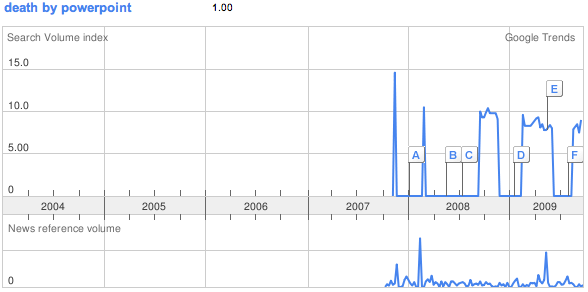
In any case, I did not know the term "PowerPoint poisoning", I only knew "Death by PowerPoint". When I looked it up on Google Trends, there were no results. "Death by PowerPoint" does appear starting with 2007. Unfortunately, it is still very much around.
"What?", "where?", "when?", "who?". These are important questions, but they are limited to facts.
"How?" is a step forward. It opens the door to discovering the mechanisms behind what we can perceive first hand. We can get closer to the meaning, but we are still limited to facts.
It is the "why?" that offers the true possibility of discovering a meaning. Only by being able to relate facts to the reasons of their existence can we interpret their value.
Kids often ask "why?". Grown-ups seldom do. As we grow older we lose this capability. Or using the words of Sir Ken Robinson, we are educated out it.
At least two things happen. First, the ridicule associated with appearing unknowledgeable pressures us to stop asking questions, particularly those kind of questions that might make us look stupid. Second, the more experience we have, the more we believe we know the answer, even when in fact we do not.
Asking questions is a skill that atrophies if not practiced. I suggest drastic actions to remedy the problem: ask every day at least 6 questions, and at least 1 one them should be a "why?".
Keep count, and if you somehow did not do it, ask them in front of the mirror just before you go to sleep. The topic does not matter. Just ask the questions as a way to keep the kid alive. He will take care of the rest.